Most brokers look at Form 5500 data as a snapshot: who’s the current broker, which carriers are on the plan, what’s the renewal date. That’s useful for building a prospect list. But it’s only scratching the surface of what the data actually tells you.
The real value of 5500 data is in the history. Every employer that files creates a longitudinal record of how their benefits program has evolved: which carriers have come and gone, how commissions have shifted, whether enrollment is growing or shrinking, and when the broker of record last changed. These patterns, when you know what to look for, are predictive. They don’t guarantee a broker change, but they tell you which employers are most likely to be open to a new conversation and when.
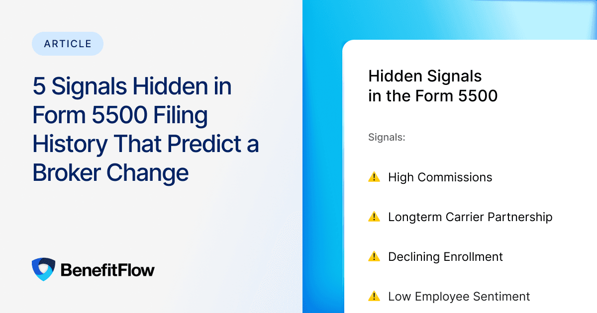
Here are five specific filing history signals that experienced brokers use to identify accounts on the verge of a change.
Signal 1: High Commissions Relative to Plan Value
Form 5500 Schedule A filings report the commissions paid to the broker of record for each policy. When you review an employer’s policy details, you can see total commissions, total premiums, and the implied per-employee-per-month (PEPM) cost for every line of business. That gives you a clear picture of what the broker is earning relative to the size and complexity of the plan.
What matters is the ratio. A broker earning $200,000 in commissions on a $10 million premium book is operating at a very different level than a broker earning $200,000 on a $3 million book. When the commission-to-premium ratio looks high relative to the number of covered lives and lines of business, it suggests the employer may be paying more for broker services than the value being delivered. When you also see no carrier changes and no plan design evolution on the employer’s History tab, the case gets stronger.
Employers don’t always notice this pattern on their own. Many HR teams look at the total premium number and the plan summary each year without scrutinizing the broker compensation line. But when someone points it out, either a consultant, a CFO, or a competing broker, it creates an immediate question: what exactly are we paying for?
What to look for: Review the employer’s Policy Details tab. Look at total commissions relative to total premiums, and check the PEPM rate across each line of business. Then cross-reference with the History tab: if the carrier lineup hasn’t changed and enrollment has been flat or declining, high commissions relative to plan size suggest the employer may not be getting active broker management. That’s your opening.
Signal 2: Carrier Stagnation Over Multiple Renewal Cycles
Carrier changes in an employer’s filing history are a sign that someone is actively managing the benefits program. The broker is marketing the plan, evaluating alternatives, and making moves when better options are available. Carrier stagnation, where the same carriers appear on every filing for five, seven, or ten years, tells the opposite story.
This doesn’t mean every long-term carrier relationship is a problem. Some carriers are the right fit year after year, and a stable relationship can reflect good broker management. But in a market where health care costs are increasing 8% to 10% annually and carrier pricing varies significantly by region and size tier, an employer that hasn’t tested the market in a decade is almost certainly leaving money on the table.
Carrier stagnation often correlates with broker stagnation. If the broker isn’t moving carriers, they may not be marketing the plan at all. That’s your opening. The outreach message writes itself: “When was the last time your broker showed you what the broader market looks like?”
What to look for: Review the employer’s policy history across filings. If the same primary medical carrier appears on every filing for five or more consecutive years with no secondary carrier evaluations visible, the account may be on autopilot. This signal is strongest when combined with rising premiums, since it suggests the employer is absorbing increases without pushing back.
Signal 3: Declining Enrollment Relative to Company Size
Enrollment data on Form 5500 filings shows how many employees are covered under each policy. When you track that number across filings and compare it to the employer’s reported headcount, you get a participation rate. A declining participation rate is a leading indicator of benefits dissatisfaction.
There are innocent explanations for small fluctuations. Seasonal workforce changes, a shift to contractor models, or the introduction of a spousal surcharge can all reduce covered lives without reflecting dissatisfaction. But a sustained decline over two or three filing cycles, especially in a company that isn’t shrinking, suggests that employees are opting out. They may be finding coverage through a spouse’s plan, through the marketplace, or simply going without.
For brokers, this is both a prospecting signal and a conversation starter. An employer losing participation is an employer with a problem their current broker hasn’t solved. Your pitch: “Your enrollment is trending down. That usually means employees don’t see enough value in the plan to justify the cost. Let’s talk about what a more competitive design could look like.”
What to look for: Track covered lives across two or more filings. A drop of 10% or more in participation without a corresponding drop in total employees is a strong signal. Cross-reference with the Benefits Rating for that employer: if employee sentiment is also low, the case for outreach gets even stronger.
Signal 4: Rapid Carrier Turnover in a Short Window
The History tab tracks carrier modifications across filing cycles. A single carrier change over several years is normal and usually signals healthy plan management. But when an employer swaps carriers two or more times in three filing cycles, that’s a pattern worth investigating. Rapid carrier turnover usually means one of two things: the employer is unhappy with the options their broker is presenting, or the broker is chasing short-term pricing without solving the underlying cost drivers.
Either way, the employer is signaling frustration. They’re willing to disrupt the plan year after year, which means they haven’t found a stable solution. That frustration extends to the broker who keeps recommending changes that don’t stick. An employer cycling through carriers is an employer that’s open to a fundamentally different approach, not just another carrier swap.
For prospecting purposes, this signal is strongest when the carrier changes span the same line of business. An employer that changed their medical carrier three times in four years has a medical plan problem. If you can walk in with a stable, data-backed recommendation and explain why your approach would break the cycle, you’re offering something the incumbent broker has failed to deliver.
What to look for: Open the History tab and filter by medical policies. Count the carrier changes across the available filing history. Two or more changes in three or fewer cycles is the threshold. Also check whether the broker of record stayed the same through those carrier swaps. If the same broker oversaw multiple failed carrier placements, the employer may be questioning the relationship even if they haven’t acted on it yet.
Signal 5: Long Broker Tenure Combined with Low Employee Sentiment
This signal requires combining two data sources: the broker of record history from 5500 filings and the employer’s Benefits Rating derived from employee review platforms. On their own, each data point tells a partial story. Together, they’re one of the strongest indicators of a broker relationship that’s ripe for disruption.
Long broker tenure by itself isn’t a negative signal. Stability can reflect a healthy, well-managed relationship. But when an employer has had the same broker for seven or more years and their Benefits Rating is below average, it suggests that the broker’s long tenure isn’t translating into a strong benefits experience for employees. The employer may not be actively dissatisfied with their broker, but their employees are dissatisfied with their benefits. That’s a gap a new broker can address.
The outreach approach here is different from the other signals. You’re not leading with cost or plan design. You’re leading with employee experience: “Your benefits program has been stable for a long time, but employee feedback suggests there may be room to improve the experience. I’d love to share what we’re seeing employers your size do differently.”
What to look for: Identify employers where the same broker has appeared on the five or more most recent filings and the Benefits Rating is 2.5 or below (on a 0 to 5 scale). The combination of relationship inertia and measurable employee dissatisfaction is one of the clearest openings in benefits prospecting.
Putting the Signals Together
Any one of these signals is worth investigating. Two or more appearing on the same employer profile is a strong prospecting indicator. The most actionable accounts are the ones where multiple signals converge: commissions look disproportionate, carriers are churning, enrollment is slipping, and employee sentiment is low. That’s an account where the current broker relationship is running on inertia rather than performance.
The practical workflow is straightforward. Start with your target territory and filter by your ideal customer profile (size, industry, geography, funding type). From there, review the filing history for each employer that meets your criteria. Score accounts based on how many of the five signals are present. Prioritize outreach to employers with two or more signals and a renewal date in the next 60 to 120 days. Build your outreach messaging around the specific signals you’ve identified rather than a generic value proposition.
A note on data sources
All five signals are derived from information that employers report publicly through their annual Form 5500 filings with the Department of Labor. These filings are required for health and welfare plans with 100 or more participants and are updated on a rolling basis as new submissions are processed. The Benefits Rating referenced in Signal 5 is derived separately from employee review platforms. Combining the two data sources gives a more complete picture than either provides alone.
Read the History, Not Just the Snapshot
The difference between a broker who prospects from a static list and a broker who prospects from filing intelligence is the difference between guessing and knowing. The signals are in the data. They’ve always been in the data. The question is whether you’re reading the history or just looking at the latest filing.
Employers don’t change brokers randomly. They change when something in the relationship stops working: costs look out of proportion, carriers keep changing without results, employees are unhappy, or the broker’s advice isn’t keeping up with the employer’s needs. All of these patterns leave traces in the filing history. Your job is to find them before the employer starts looking on their own.
See Filing History for Any Employer
BenefitFlow’s employer profiles include a History tab that tracks enrollment trends, broker of record changes, carrier modifications, and commission and premium data across multiple filing cycles. Combined with the Benefits Rating, Deep Research, and renewal date filters, it’s built for exactly the kind of signal-based prospecting described in this article. Visit benefitflow.com to see how it works.
Additional Resources
- BenefitFlow: Employer Profiles Guide
- BenefitFlow: Form 5500 FAQ
- BenefitFlow: Which Insurance Products Are Reported on the Form 5500?
- BenefitFlow: What’s Included on Form 5500 and What BenefitFlow Adds
- The Broker’s Guide to Winning Accounts from Competitor Books of Business (BenefitFlow)
All employer data referenced in this article is derived from Form 5500 filings submitted to the U.S. Department of Labor. The Benefits Rating is calculated by BenefitFlow from employee review platform data. Form 5500 filings are required for health and welfare plans with 100 or more participants.